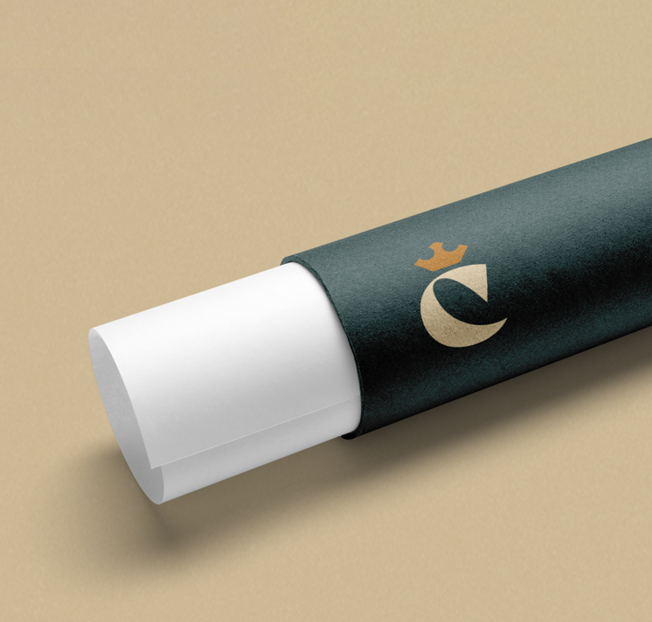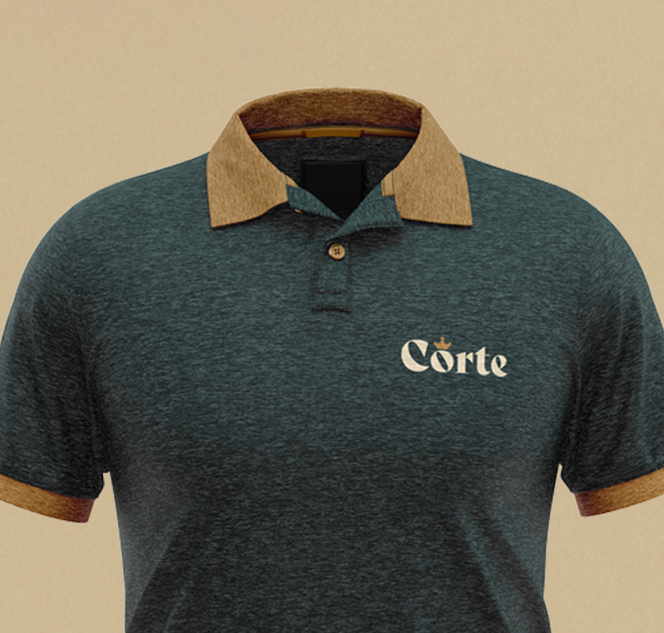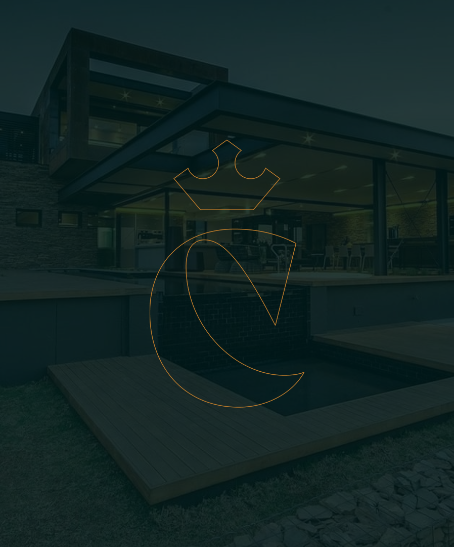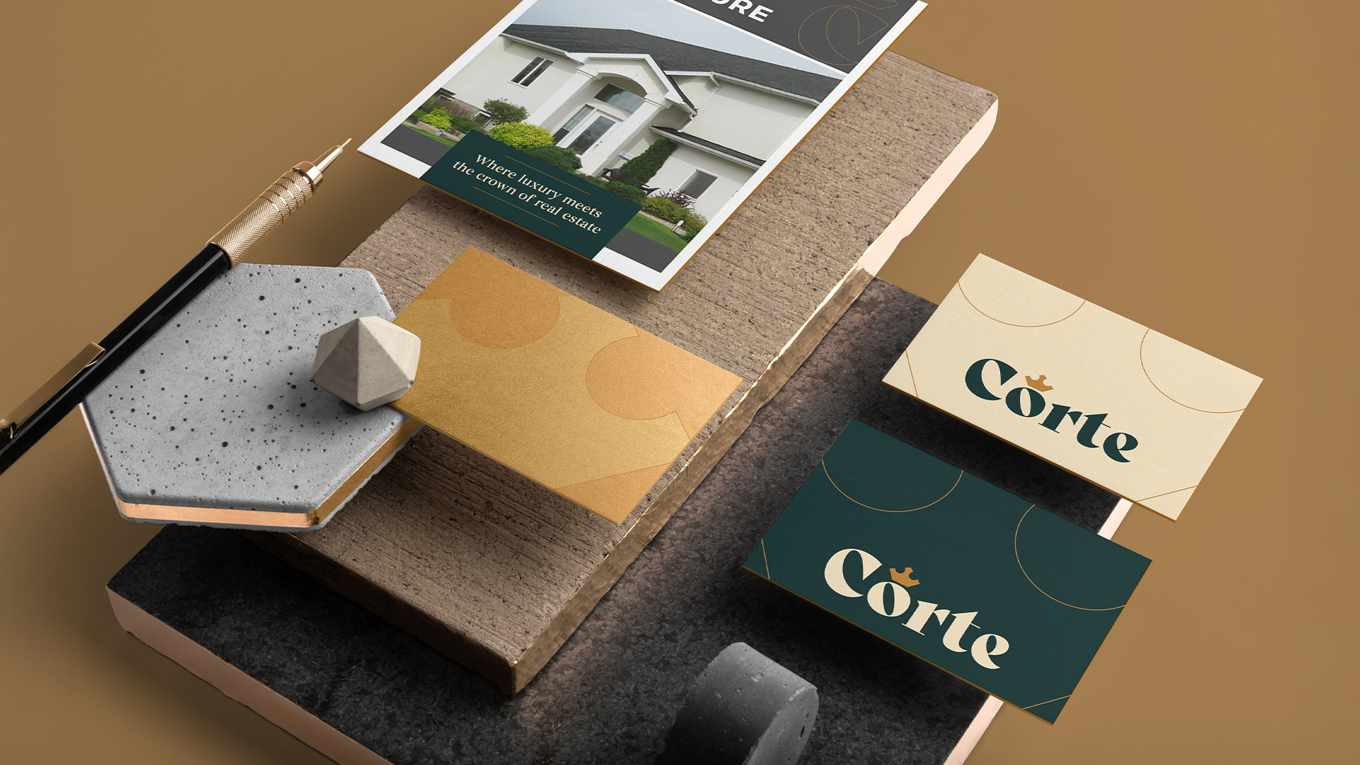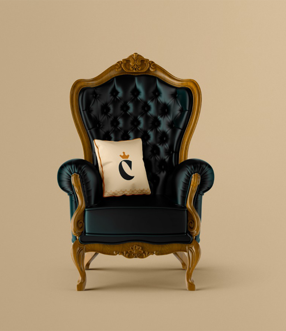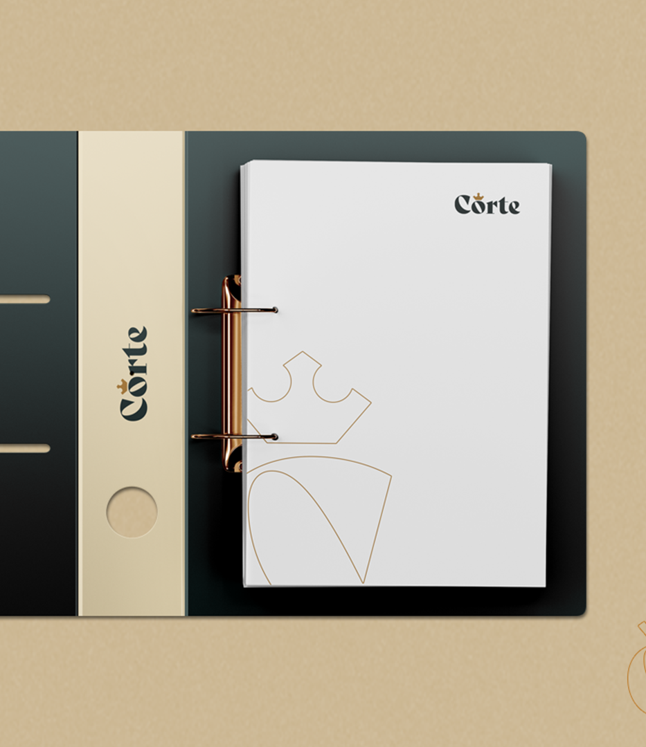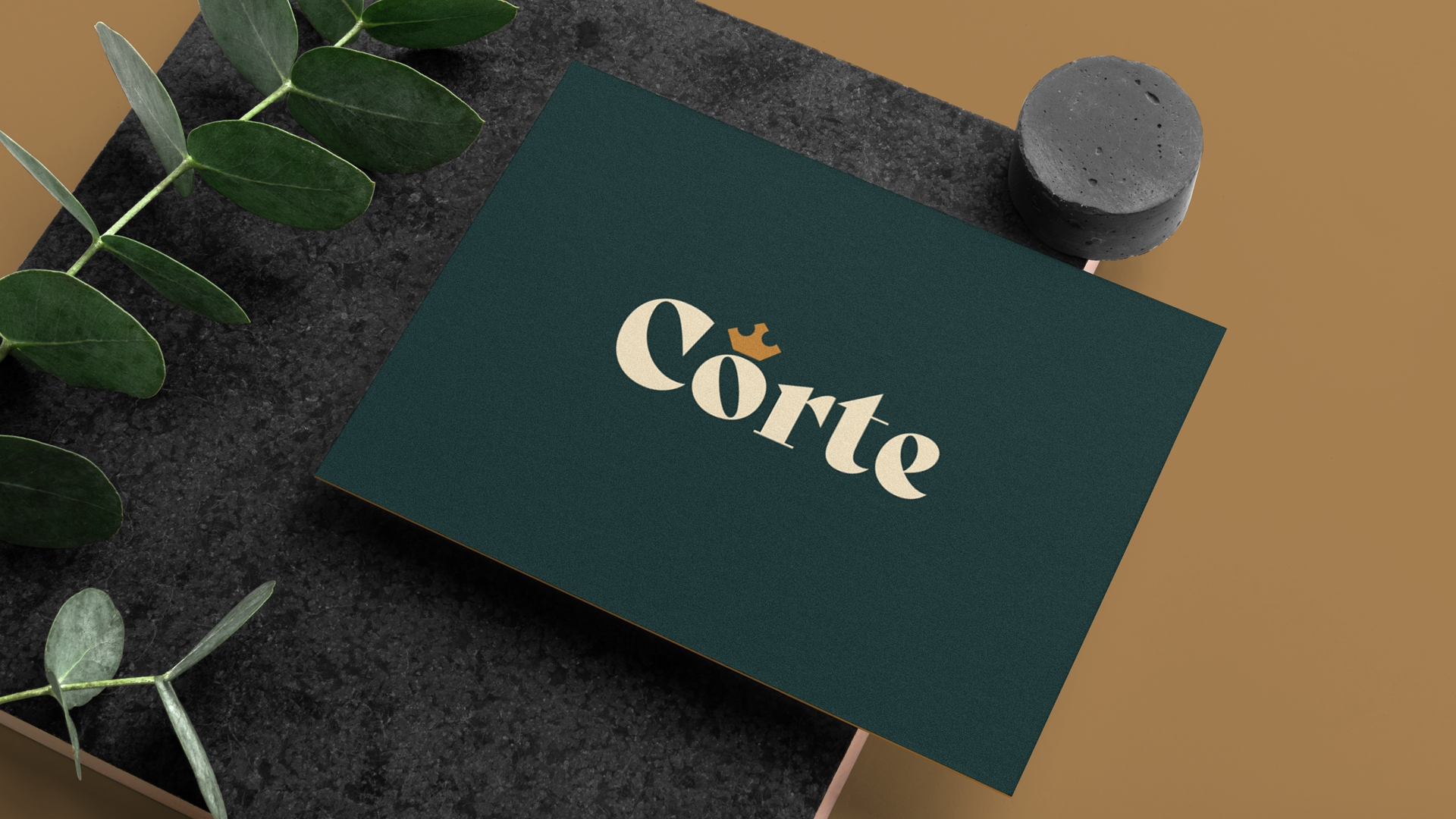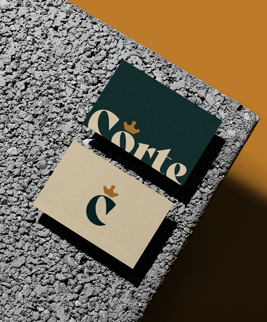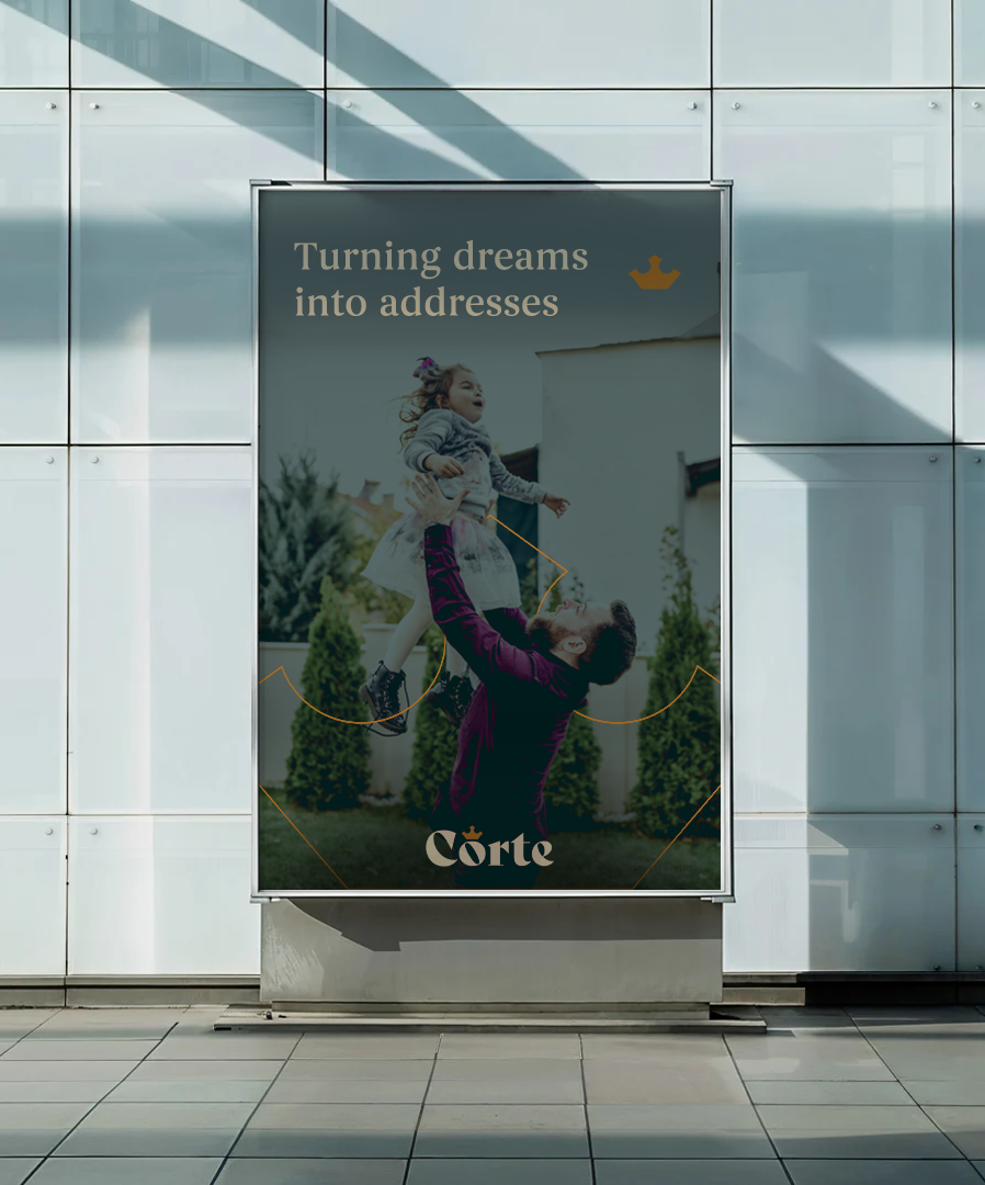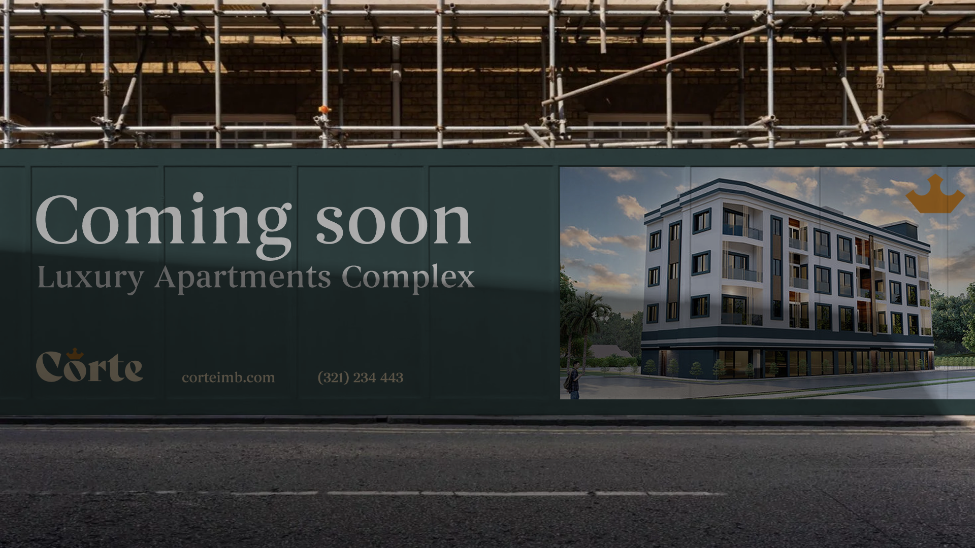
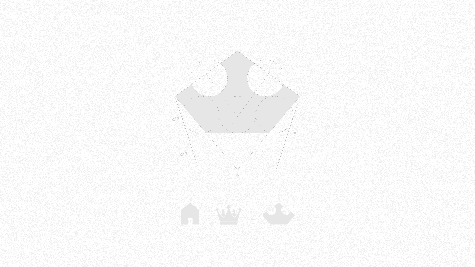
In the context of monarchies, the term "Corte" (in Portuguese) refers to the residence of the king, whether permanent or temporary, as well as to the royal household and its attendants. With this rich historical significance in mind, the brand was designed to embody the essence of royalty and grandeur. The central concept behind the brand revolves around this meaning, which is why a crown was chosen as the iconic symbol, directly referencing the authority and prestige of a royal court.
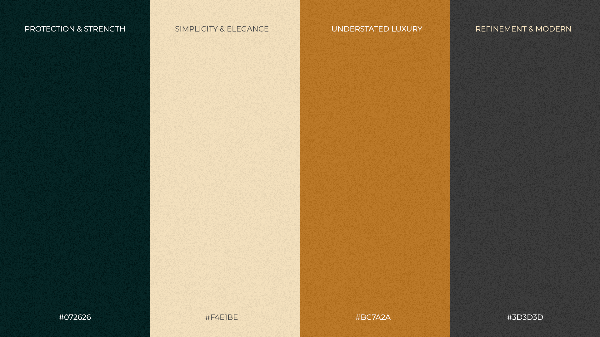
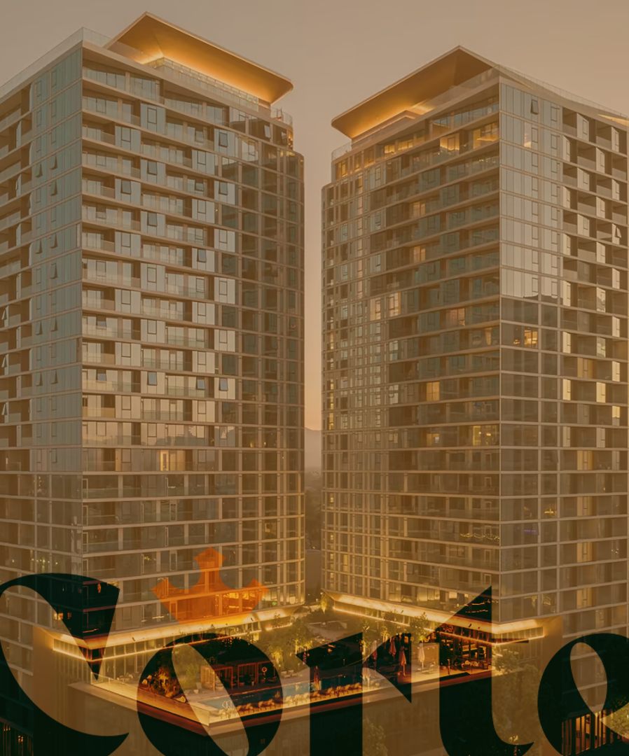
Given that the company specializes in luxury homes, the color palette was carefully selected to evoke themes of power, wealth, and opulence, reinforcing the luxurious nature of the brand. The typography features a refined serif with varied thickness, contributing to a sense of sophistication and exclusivity. This thoughtful design approach ensures that the brand resonates with the essence of luxury while maintaining a timeless, regal aesthetic.