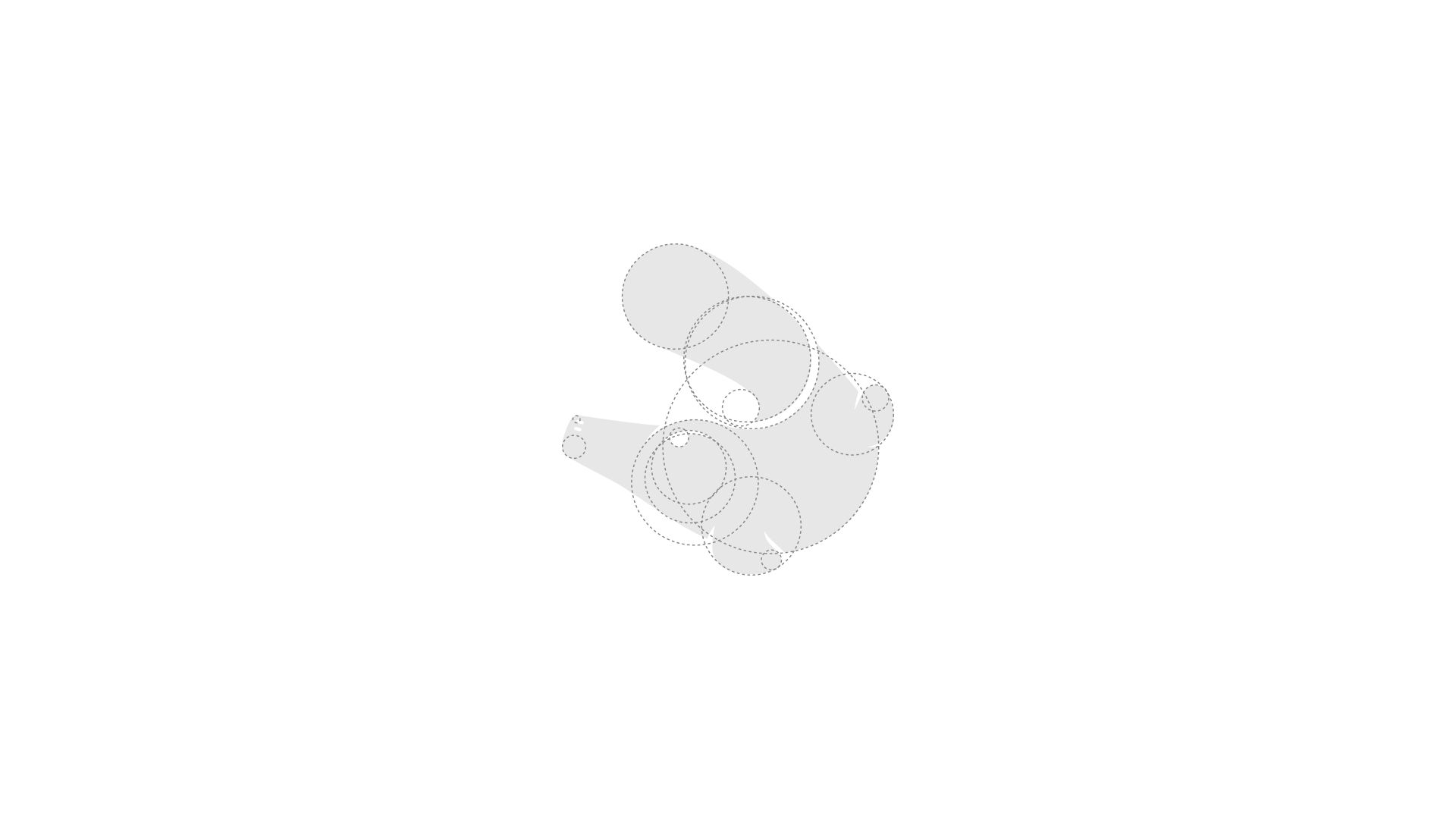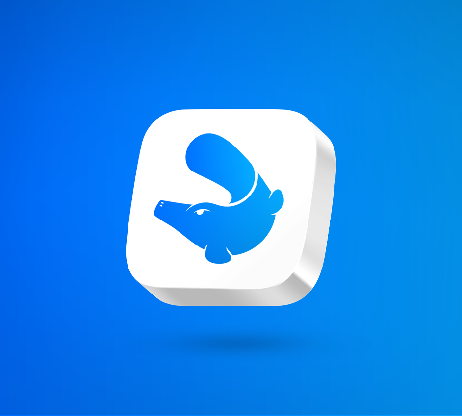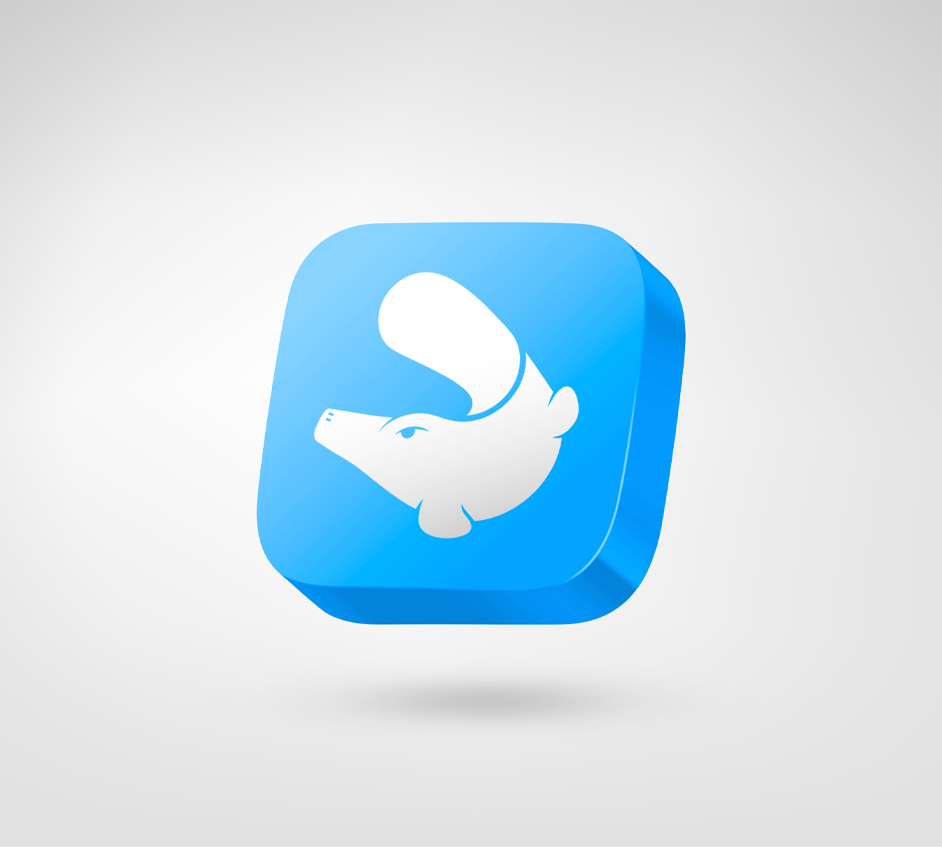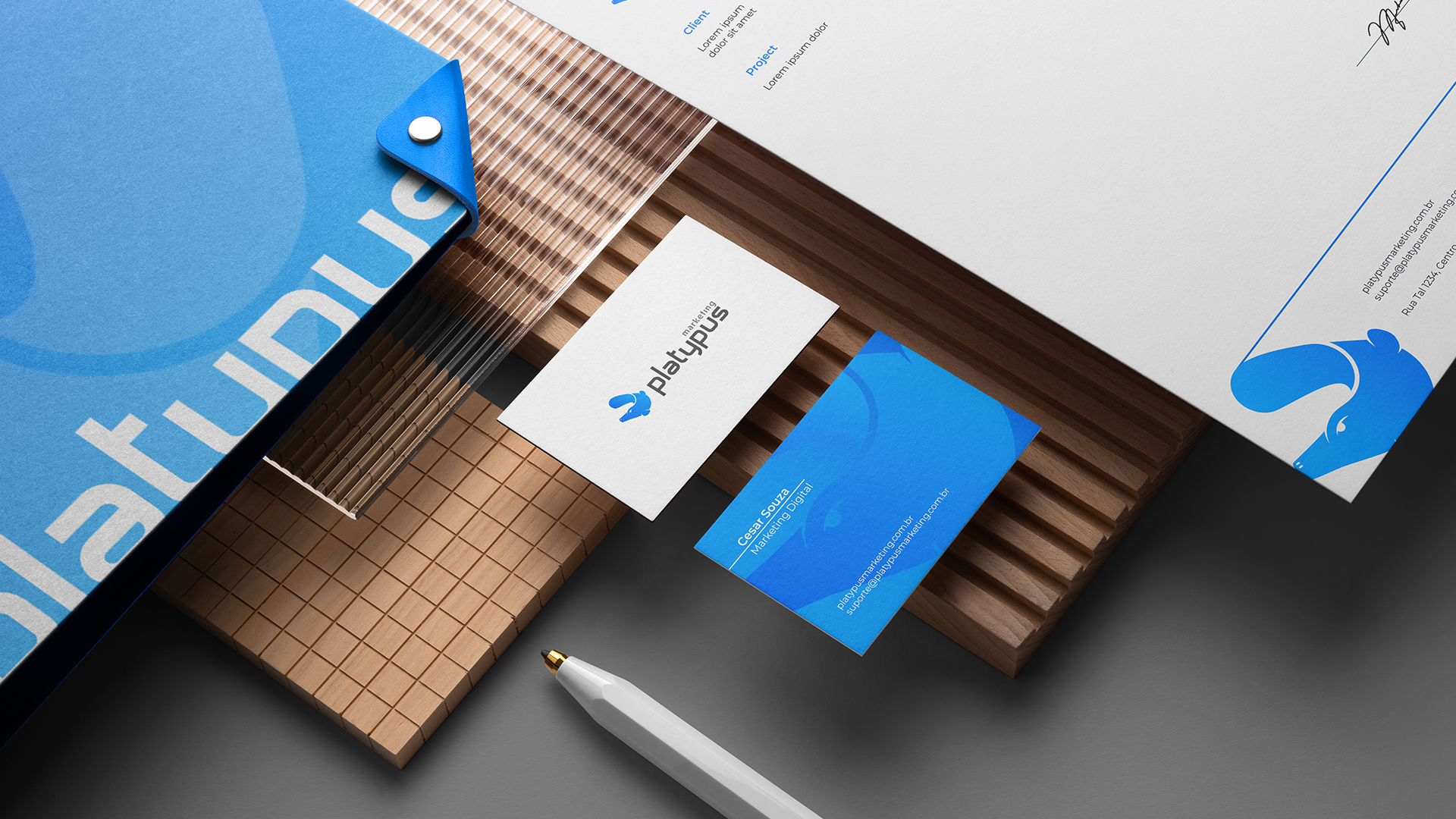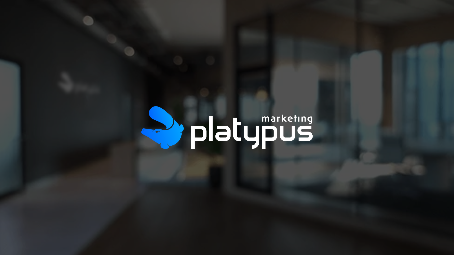
The challenge was significant—translating an uncommon animal (Platypus) into a recognizable and distinctive mark without confusion with similar creatures like ducks, geese, or seals.
tte was crafted. The icon is designed using a circle, symbolizing the universe of possibilities the company offers its clients. This shape also represents the cyclical nature of the company’s work—continuous improvement in processes, learning, and innovation.
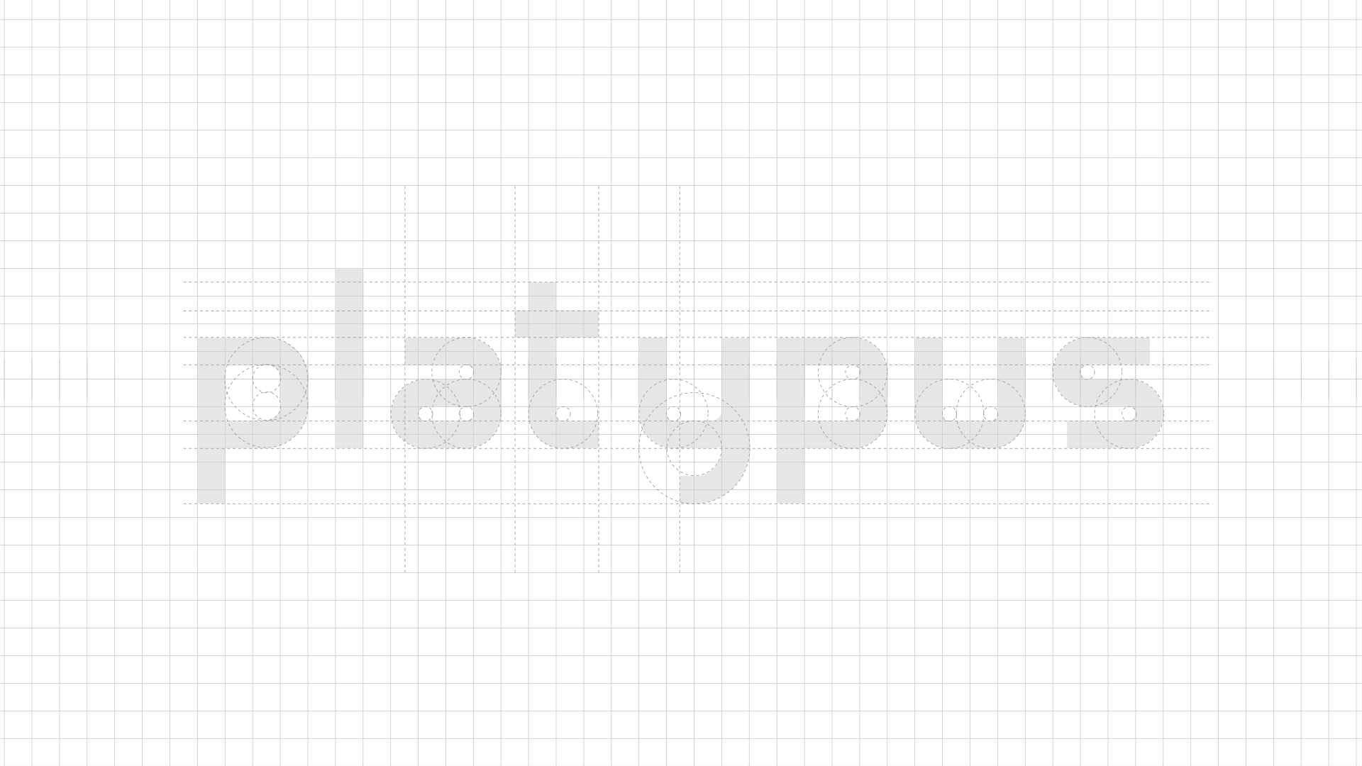
To reinforce uniqueness, the typography was exclusively designed for this project. Its straight forms with subtle curves and thick lines add a sense of modernity and simplicity, making the brand memorable and distinct in its market.