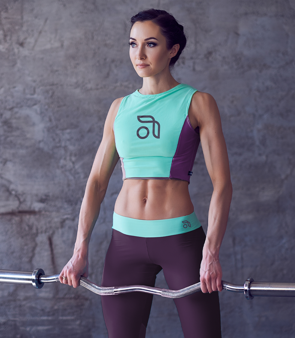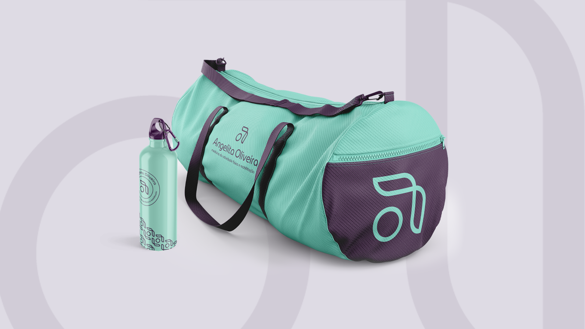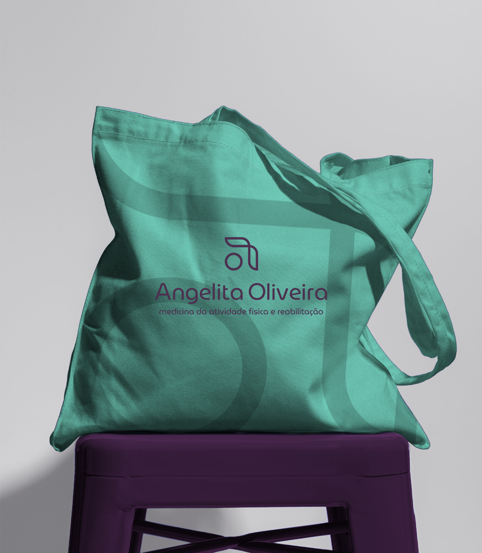

A Brand That Moves with Purpose.
Crafting a brand that harmonizes rehabilitation and physical education required a delicate balance. The challenge? Creating an identity that resonates with both professionals and clients—without alienating one or misleading the other.
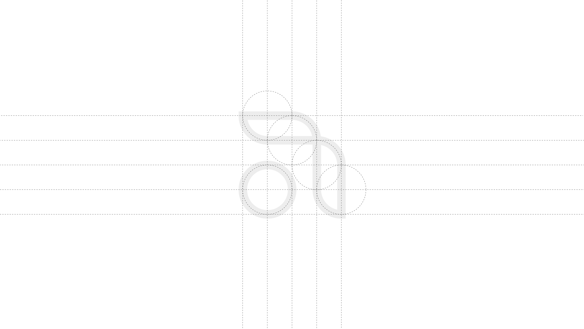
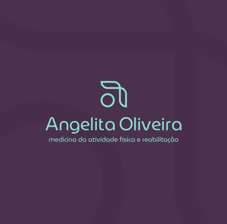
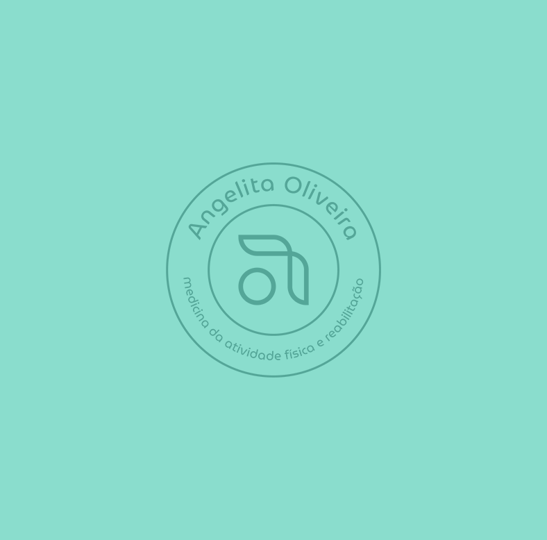
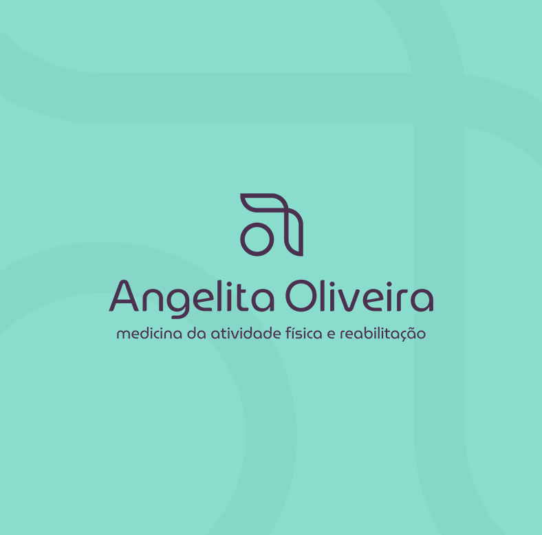
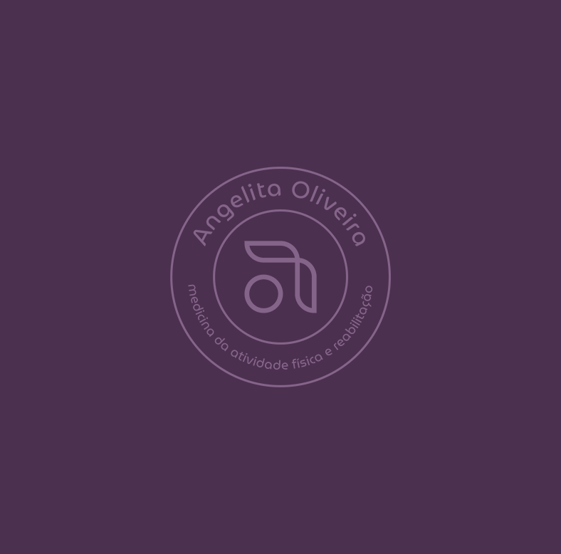
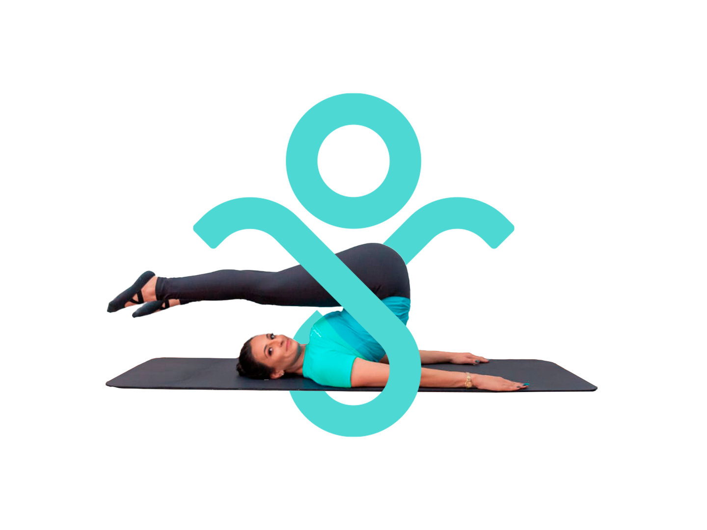
A Symbol with Depth.
The logo is more than a mark; it’s a visual narrative:
Negative space mastery: The lowercase "a" subtly integrates the letter "o", ensuring a clean and modern look.
The human form: When rotated 90º, the icon reveals a silhouette with crossed arms, embodying strength, stability, and confidence.
The motion of recovery: The upper curve symbolizes a Theraband, an essential tool in rehabilitation, while also representing joint flexibility—mirroring the natural movement of the knee, wrist, ankle, and shoulder.
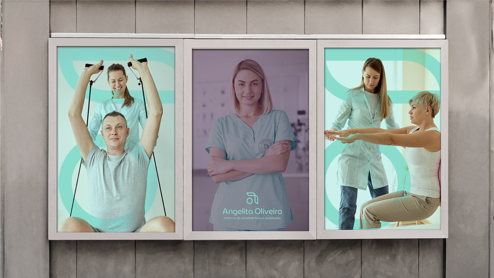
Bridging Two Worlds.
This brand isn’t just a visual identity—it’s a statement. It speaks to both rehabilitation specialists and fitness professionals, creating a space where science meets movement, and expertise meets empowerment.